The famous design axiom “form follows function” was coined by architect Louis Sullivan in the late 1800s. While the concept has launched the careers of many (including Frank Lloyd Wright) and boasts enough fodder to fill the pages of a master’s thesis, a high-level description is:
The purpose of a final product should be the starting point for its design.
Function can sometimes be an afterthought for those who seek to create something flashy or eye-catching (like those gorgeous shoes that didn’t make it more than 30 minutes on your feet). But, a great designer is going to appreciate function – it gives us inspiration to draw upon and pencils in some boundaries that our scattered creative minds need.
Function is often complex and defined by many factors, such as individual values, circumstances and context. We can’t simply follow the same formula for all people, businesses or projects; which is why more than one design of a chair or phone can exist.
Sullivan believed that form and function should be one, and let us tell you something…we are ON BOARD with this wisdom. It rings true to our favorite go-to soap box topic that strategy should come before design, always. Beauty exists within design, but it’s a direct result of pursuing functionality. And ultimately, if the final product doesn’t achieve it’s intended purpose, it’s just a big waste of space, time and resources.
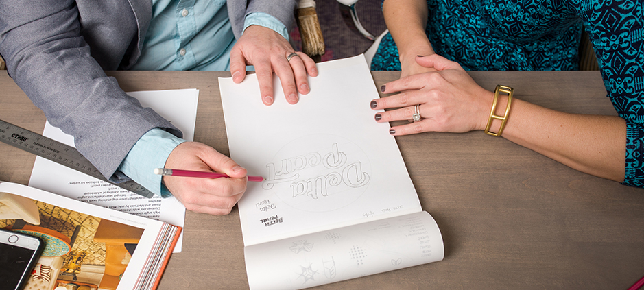
To avoid that end, here is our 6-point checklist to work through before opening your sketch book on any design project.
- Clearly define the problem and solution: What was the impetus for the project in the first place? How can that need be met? What will be lost if a problem isn’t overcome, and conversely, what is gained if it is? Know what you’re doing, why you’re doing it and what the intended end game is before you call the plays.
- Understand the context: Who is your audience? What circumstances will bring them to interact with your design? What will their disposition be upon that interaction – are they frustrated, inspired, panicked? Each of these elements should speak into every inch of design. For example, the individual factors that contribute to an aggregate context will determine whether your first step is one of overcoming or leaning into.
- Identify the differentiator: What is unique about your solution? How is it better than anything else out there? Why will anyone care? It’s not bragging, it’s self-awareness. Know the value of your offer, so you can boldly (yet tactfully) own it.
- Visualize the interaction: How will the user engage? What path(s) will the user take to bridge the gap between problem and solution? What are the potential roadblocks?
- Simplify: Too often, the curse of knowledge is a burden in the design process. In a study conducted by Google, websites with low visual complexity had a higher rate of appeal among users. When you’re close to a project, everything seems important. That can easily evolve into clutter. Take a step back to define what is most important in descending order. The top of your list should define your design, and the subsequent points should inform it.
- Name the win: This one may seem like a no-brainer, but you’d be surprised how often we’ve seen wheels spinning feverishly with no awareness of direction. What does success actually look like?
Answering these questions can prevent the final product from simply describing the water to someone who is drowning in it. More than that, it can be the difference between a looky loo and a sale. If you’re not convinced your website design process checked all the boxes, take us up on our free website audit to receive a list of immediate action steps you can take to improve your results.


