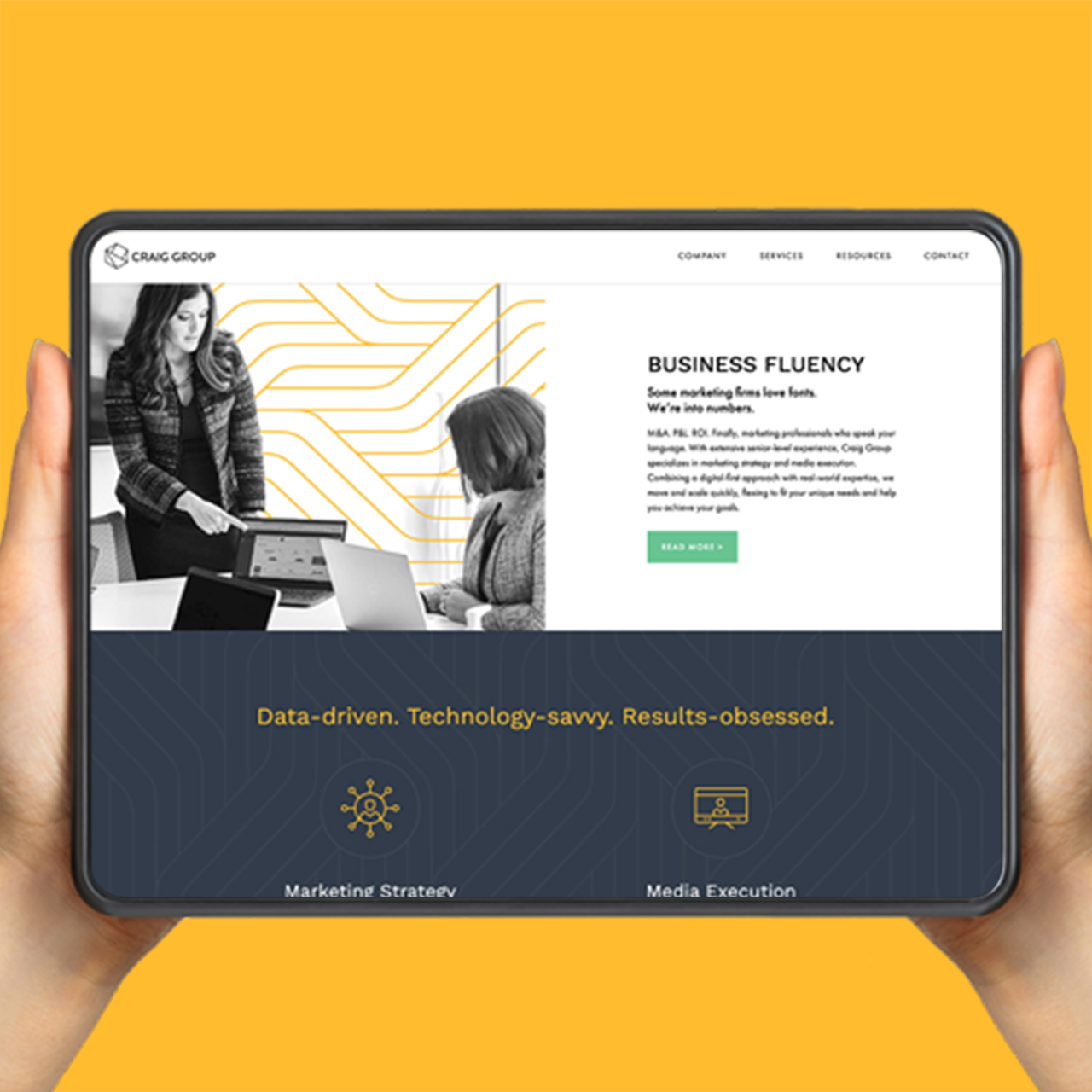
Branding + Design
JP Services
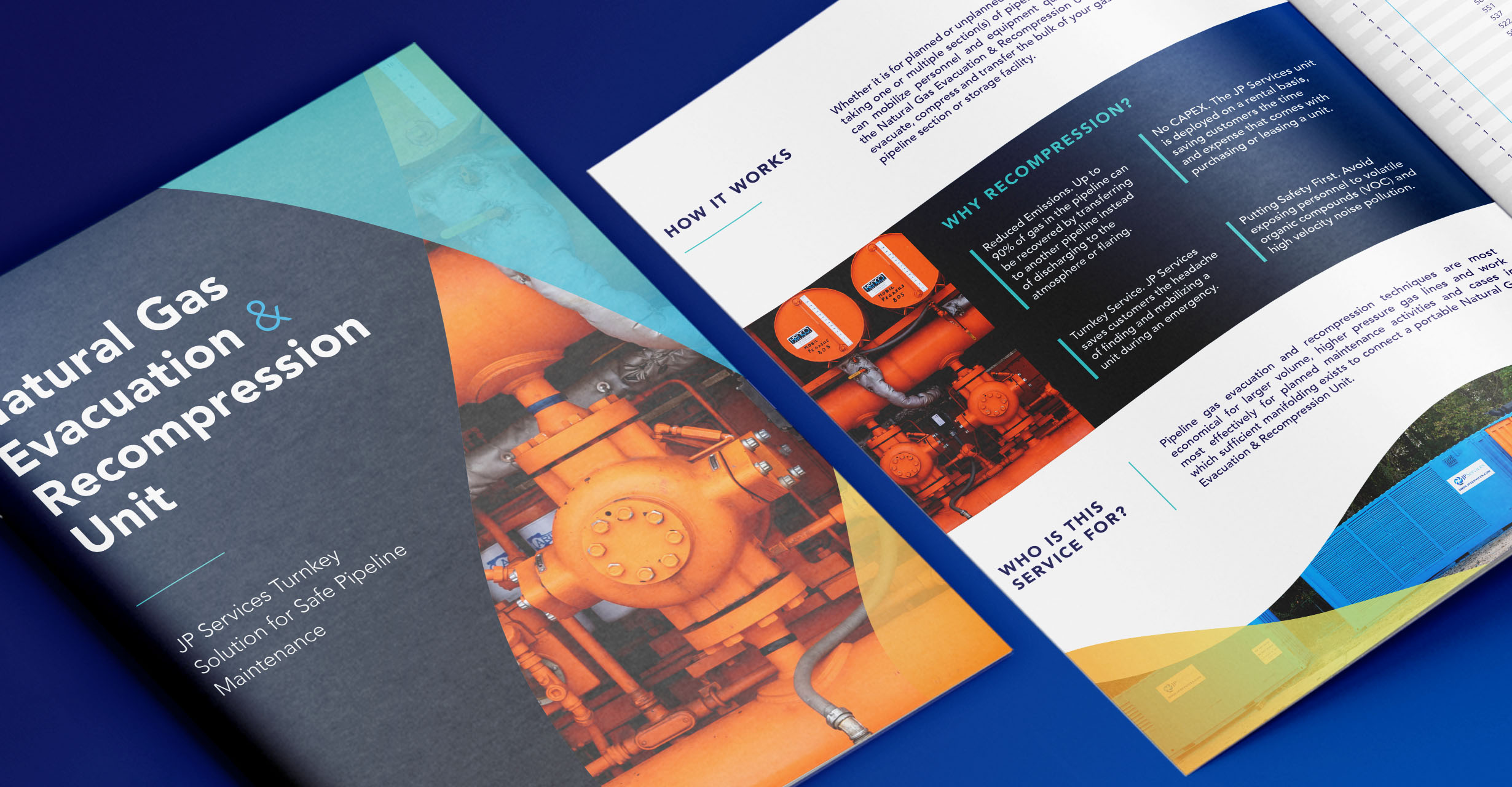
Craft marketing collateral to showcase JP Services’ innovative Natural Gas Evacuation and Recompression Unit.
The Challenge
JP Services specializes in asset integrity solutions and testing for the oil and natural gas industry. As a leader in regulatory compliance and risk minimization, they developed an innovative Natural Gas Evacuation and Recompression Unit that would transform industry safety standards. They needed marketing materials that would effectively communicate this breakthrough solution’s benefits: reduced emissions, improved safety protocols, and resource conservation. With a highly technical audience and complex product offering, they needed a strategic approach to content development and design. The challenge was creating compelling sales tools that would resonate with their technical audience while maintaining their established brand presence and demonstrating their expertise in pipeline integrity solutions across the energy sector.
What We Did
We developed a comprehensive suite of marketing materials centered around JP Services’ new technology. Our approach began with refining complex technical information into clear, benefit-focused messaging. Through thoughtful design choices and custom photography, we created materials that immediately answer the how, why, and who of their solution. The resulting sales tools include a polished brochure, custom presentation templates, and trade show materials. The materials work together as a unified system, equipping the JP Services team with professional tools to showcase their innovation to potential clients. The cohesive design reinforces their industry expertise while providing their sales team with powerful resources that maintain brand consistency and drive meaningful client conversations.
VIEW THE SITEHightlights
- Tradeshow Collateral
- Graphic Design
- Sales Brochure
- PowerPoint Template
- Custom Icons
- Marketing Collateral
- Custom Photography
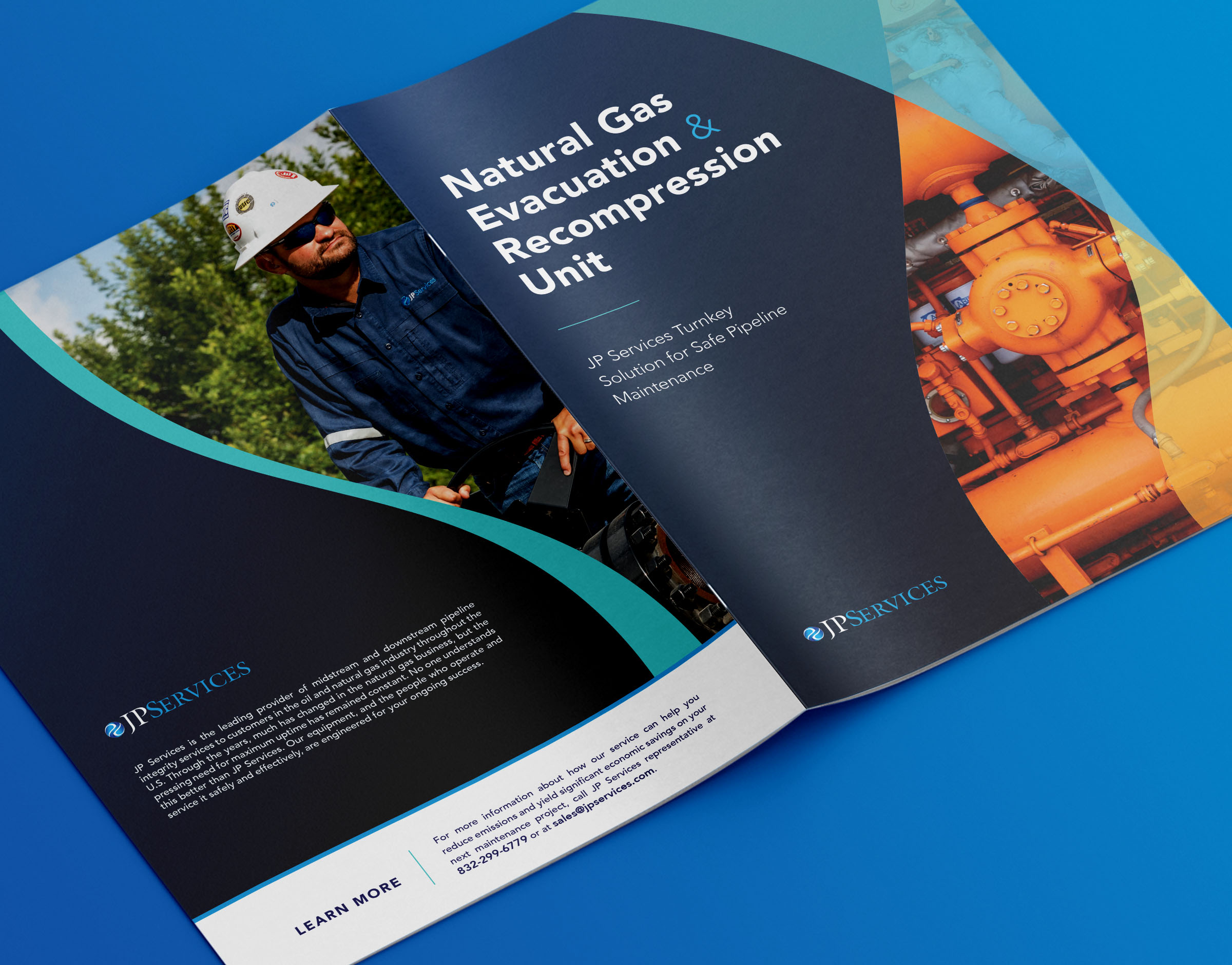

Our design solution pairs clean layouts with custom photography of JP Services’ team in action. Strategic use of color and typography creates clear information hierarchy, while custom icons simplify complex technical concepts. The cohesive visual system adapts seamlessly across all materials, from digital presentations to printed collateral, ensuring maximum impact at every touchpoint.